Selling on an e-commerce Website
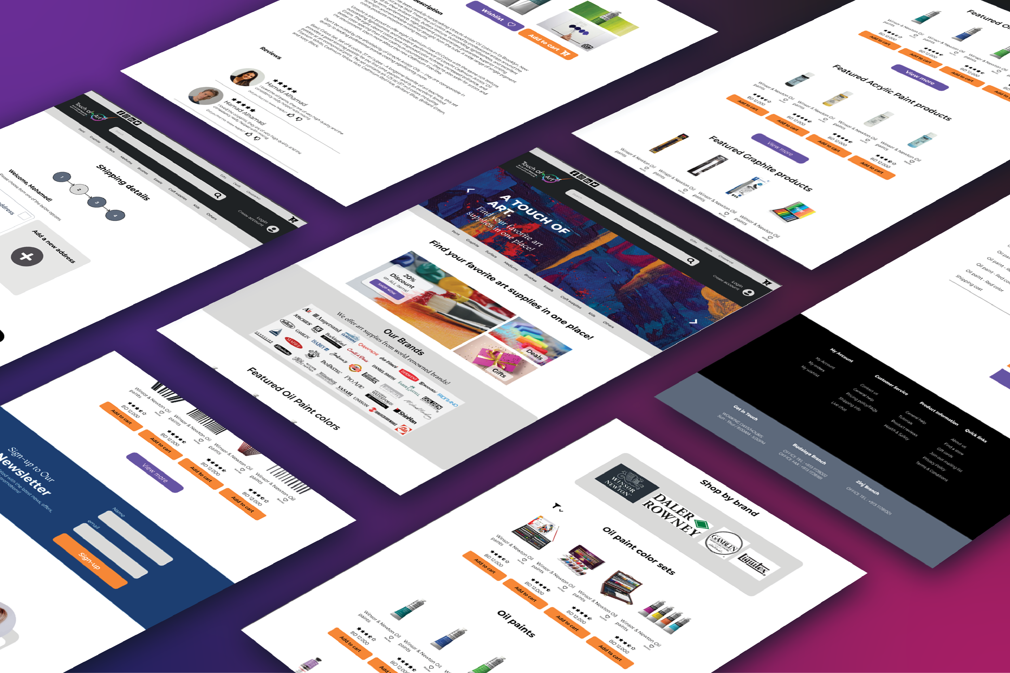
As a UX Designer, I am equipped to research and provide an in-depth analysis of UX design for Touch of Arts which is an Arts Supply Shop and E-commerce store.

What Makes Great Design?
Simplifying Navigation
Once we have a clear understanding of the target audience, we can design the website navigation to suit their needs.
Navigation should be simple and easy to use. Users should be able to find what they are looking for quickly and easily.
This can be achieved by using clear categories and subcategories, as well as providing users with search functionality.
Clear & Accurate Product Descriptions
When it comes to purchasing art supplies,
customers need to know exactly what they are buying.
Providing clear and accurate product descriptions is essential to ensure that customers can make informed decisions. The descriptions should include information such as the size, color, and material of the product.
Including high-quality images also helps customers to get a better idea of what they are purchasing.
Easy Checkout Process
The checkout process should be simple and intuitive, with as few steps as possible.
Customers should be able to easily add items to their cart, view their cart, and complete the purchase process.
It is also important to provide customers with multiple payment options, including credit cards, PayPal, and other popular payment methods.
Responsive Design
In today's mobile-first world, having a
website that is optimized for mobile
devices is essential.
The website should be responsive and should adapt to the screen size of the device being used.
This ensures that customers can easily browse and purchase products on their mobile devices.

The Process
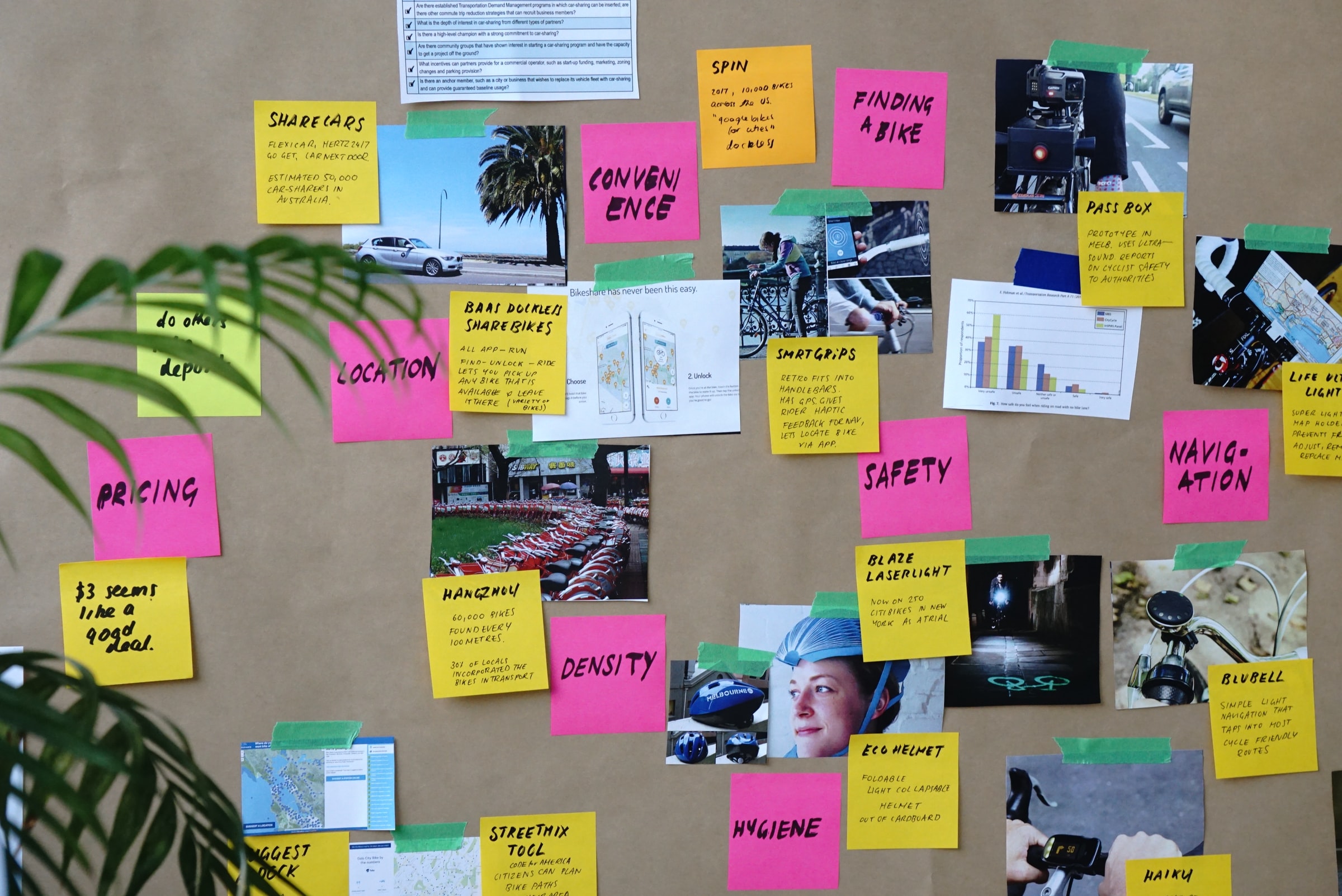
Start with Research
The first step in any design process is to understand the needs and goals of users. Conducting user research to gain insights into their preferences, behaviors, and pain points. Using the obtained information to apply in the design decisions.
Create Wireframes
Once we have a good understanding of your users' needs, we need to create wireframes to map out the layout and structure of the design. This step helps focus on the functionality of the design rather than the visual details.
Low-Fidelity Prototypes
Create low-fidelity prototypes and test these prototypes with users to gather feedback and refine the design as needed.
Develop a Visual Style
Once there is a solid foundation in place, it's time to bring the design to life with a visual style. This includes choosing a color palette, typography, imagery, and other visual elements that align with the brand and resonate with the users.

